Red was telling shoppers to stop. We took it off the buttons, and conversions more than tripled.
Kül Grilles sells premium vent covers on Shopify. We swapped red calls-to-action for black and gold, added reviews to the product page, and cut a step out of the path to buy. Here is the early read from a live test.
📈 Revenue per visitor up 273% (early read, all devices)
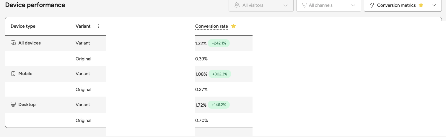
🛒 Conversion rate up 242%, from 0.39% to 1.32%
🛍️ Add-to-cart rate up 32%
📉 Bounce down about 9 points, clickthrough up about 26%
⏳ Early read from a live A/B test on a small sample, still running
The client
Kül Grilles makes premium vent covers and grilles: real metal, powder-coat finishes, custom sizing down to the inch. The kind of product where the finish is the whole point. They sell on Shopify to a buyer base that leans toward the trades and toward an older reader, builders and designers who know exactly what they want.
The problem
The site was built on red. Red logo, red buttons, red 'Add to Cart', red 'Pay now' at checkout. Red is Kül's brand colour, and it is a good one. The problem was not the brand. It was red pulling double duty on every button, where it does something the brand never intended.
Red is the most universal stop signal we have. Traffic lights, brake lights, stop signs, the warning label on everything you have ever been told not to touch. On a button that is supposed to say 'yes, buy this', that instinct works against you. The store was asking for a confident click while painting the click the colour of 'wait'.
The system
We don't guess. The first month with a CRO client is always the same shape: get measurement in place, then build the roadmap off what it actually shows. Kül already had behaviour analytics running, so we had the sessions to read from day one. Then the loop that moves the number: ship a change, run it head to head against the version it replaced, read what the data says, tighten, re-test.
Why we took red off a brand built on red
Red is not a villain. On the right page it converts fine, and there are famous A/B tests where a red button beat a green one. Read those tests closely and the lesson is not that red wins. It is that the red button was the only red thing on a green page, so it stood out. The contrast won, not the colour. Colour psychology points a direction. It does not promise a number.
What red carries, in the context of an action, is caution. Decades of colour research tie red to warning and avoidance in exactly the settings where you are deciding whether to act. A 2018 stop-signal study found that a red light literally speeds up the brain's stop response, and traced it to a learned red-means-stop association. A checkout button is that kind of moment. You are asking someone to commit, and red is the colour the world has trained us to hesitate on.
Black and gold go the other way. Black is the colour high-end brands reach for to signal premium and restraint. Gold has meant wealth and status since the first crown. Coca-Cola built an empire on red for the mass market, and when it wanted a variant to feel premium in 2026, it relaunched it in black and gold. We matched Kül's gold to the brand's own best-selling finish, so the accent was theirs, not a borrowed shade. We kept red where it belongs, on the logo and the brand, and took it off the buttons.
What we changed
We did not change one thing. We rebuilt the moment of decision as a system, and ran the whole bundle head to head against the old red site.
- Checkout went from red to black, with gold accents. The 'Pay now' button turned black; the supporting links turned gold. Confident, premium, no stop sign at the last step.
- The homepage hero button went from red to a solid white 'Shop all'. Clean against the photography, out of the way of the product.
- Add to Cart went from red to solid black on every product page. High contrast, unmistakable, reading as yes instead of caution.
- We put reviews on the product page. The old page showed none. The new one leads with a real star rating and review count, so a first-time buyer sees other people already trust the product.
- We nudged the type up a notch, sitewide. Kül's buyers skew older and toward the trades, and the research on older readers is consistent: larger, higher-contrast type is easier to read, up to a sensible ceiling. So we went modest, not huge.
- We cut a step out of the path to buy. The old site pushed shoppers through an extra collection page on the way to the product. We removed it, so the path is shorter and the click lands where the money is.
The same store, before and after.
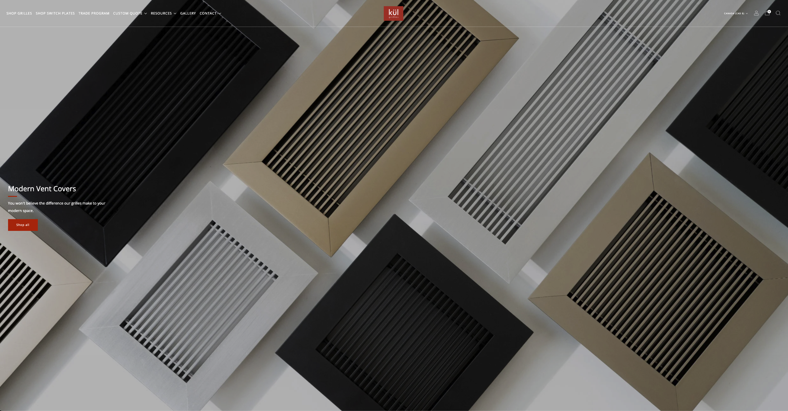
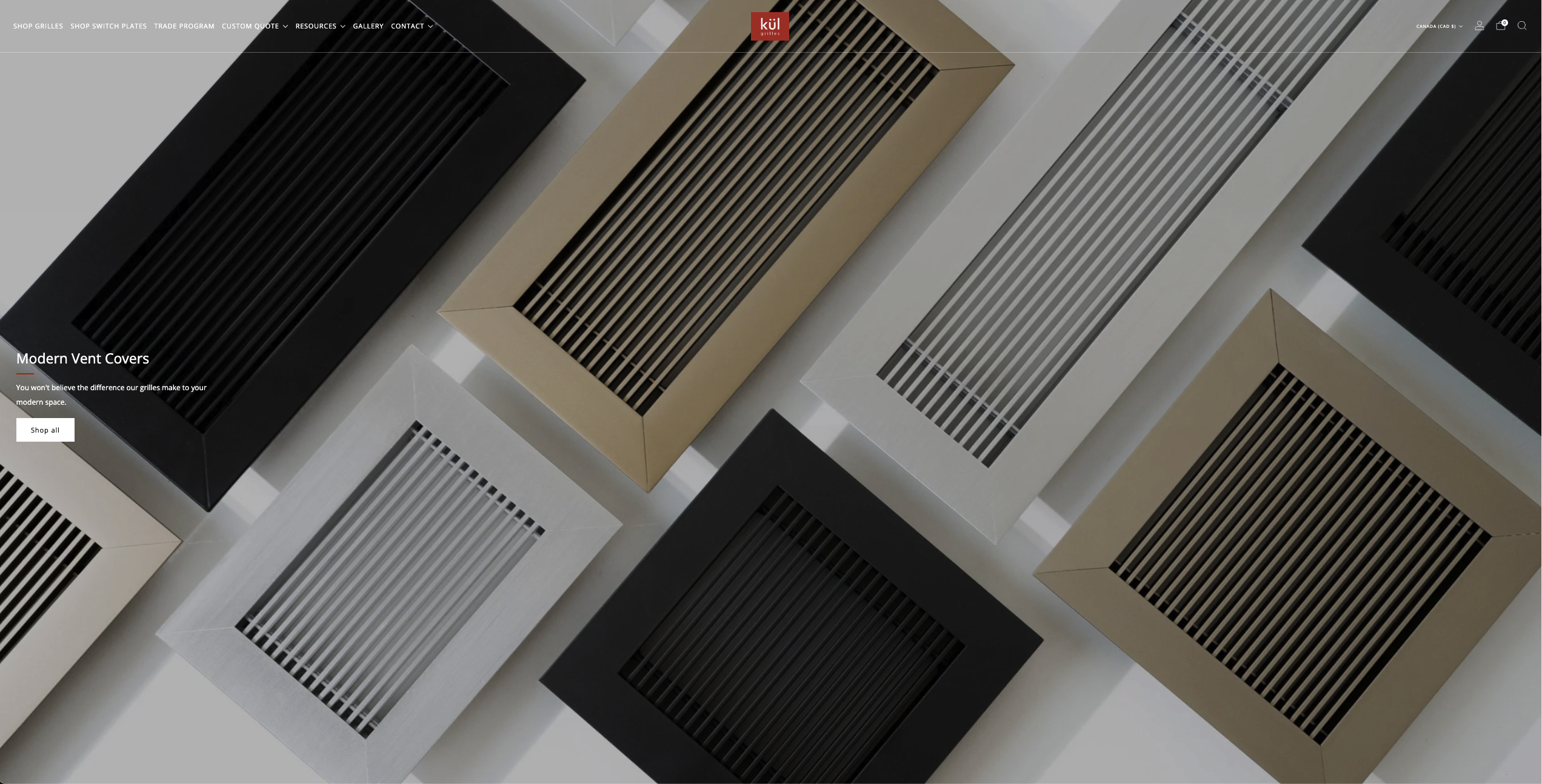


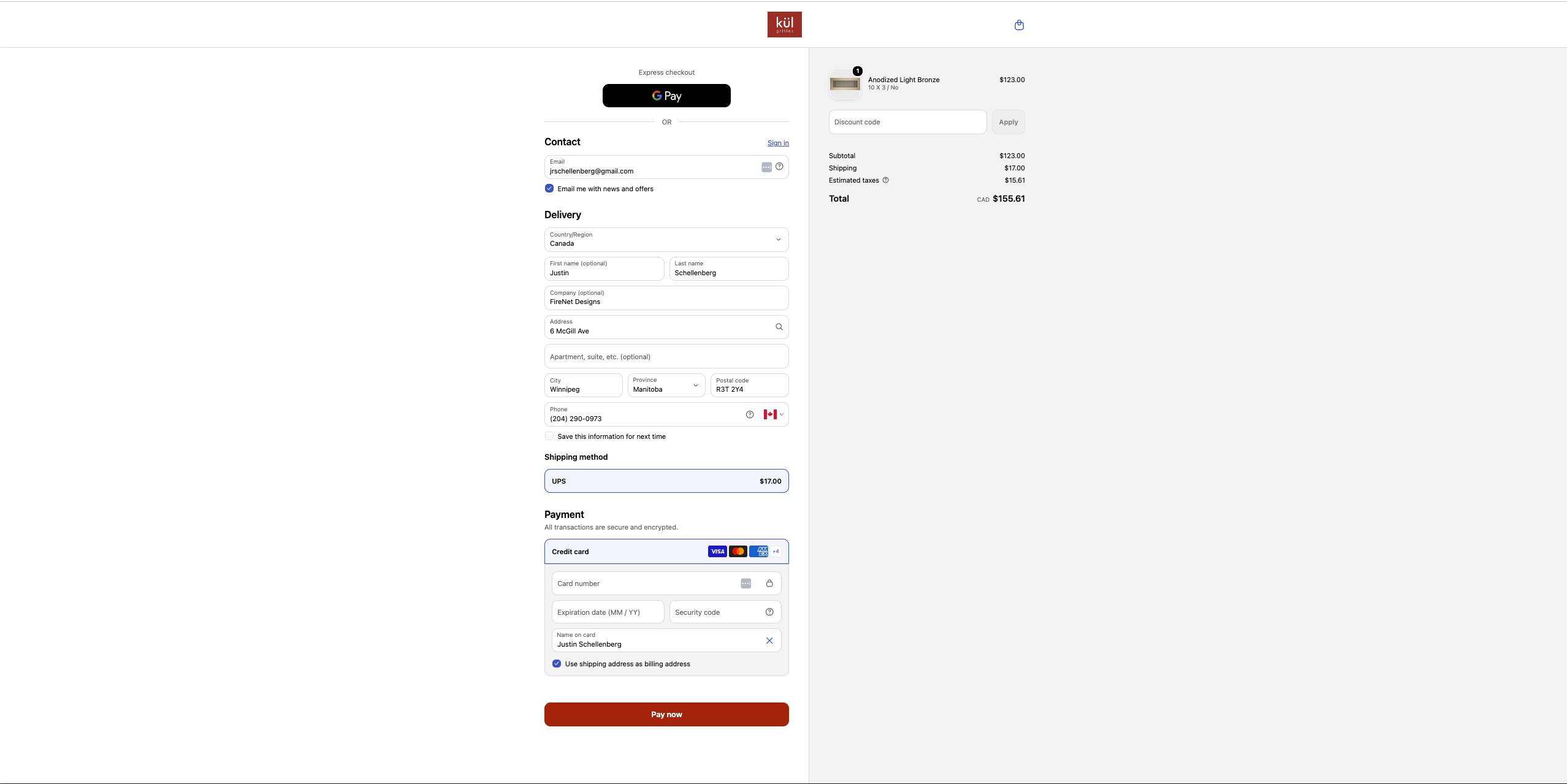
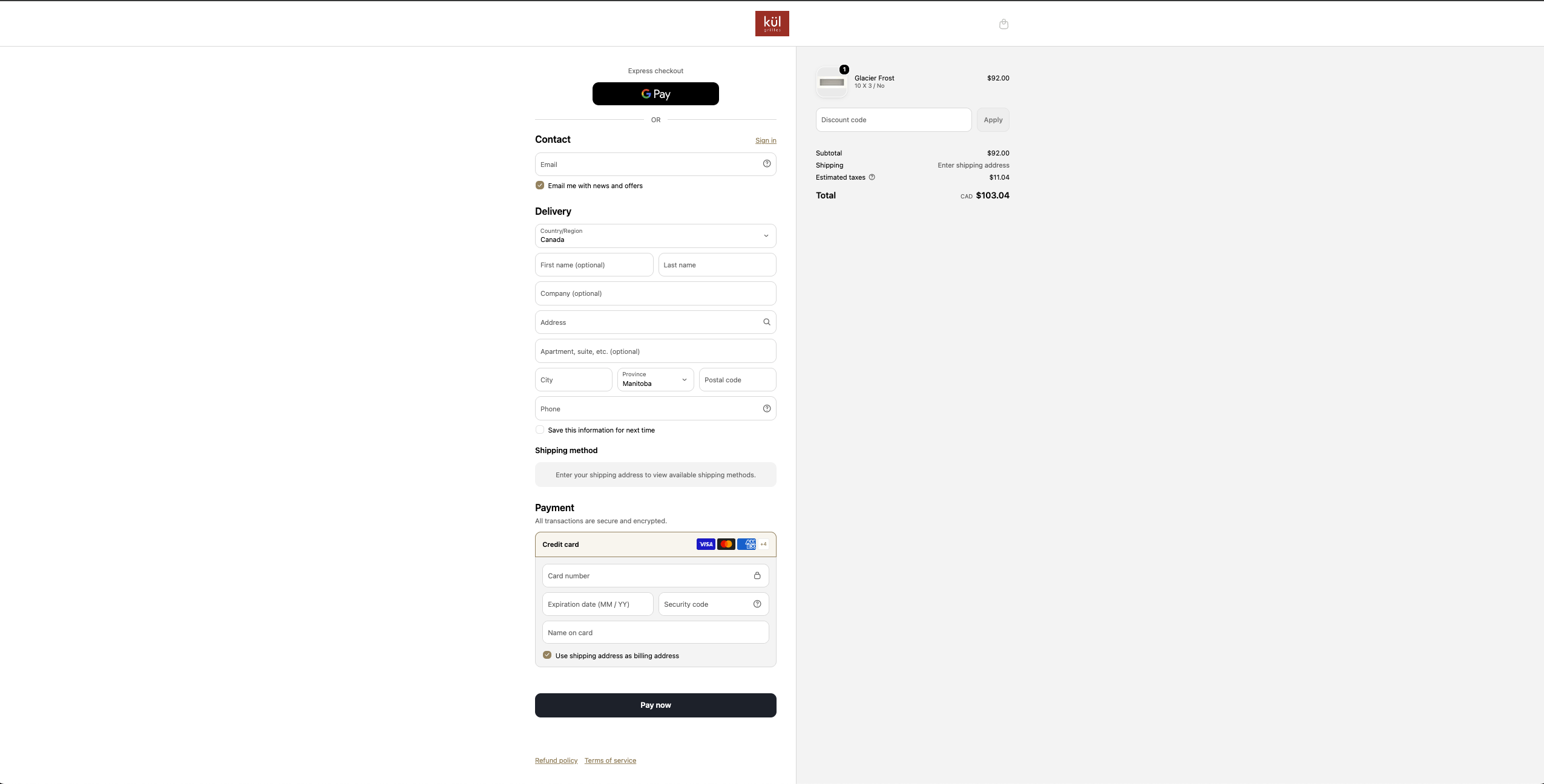
The research behind the call. The direction came from published colour research (the red stop-response study in PLOS ONE, 2018; Elliot and colleagues on red and avoidance; Nielsen Norman Group and WCAG on readability for older eyes) and real brand practice (Coca-Cola's 2026 black-and-gold premium relaunch). The number came from testing it on Kül's own traffic.
The honest middle
Cindy, Kül's founder, pushed back on removing red. Fair. It is her brand colour, and 'the internet says red converts' is a real thing people say. We did not win that with an opinion. We won it with a smaller test first: we pulled red off the homepage on its own and watched clickthrough go up and bounce come down. Once the homepage data pointed the same way the theory did, the full black-and-gold swap was an easy yes instead of a leap of faith.
And the board is not all green. Two numbers went the other way, and we are not scrubbing them. Mobile add-to-cart dropped about 14% in this test, the one clearly negative cell, even though mobile conversion and revenue per visitor both jumped. Desktop average order value slipped about 6%, more than covered by the extra orders, but a real dip and it stays on the record. That is the method, not a victory lap. The reds are where the next test comes from.
The results
We ran the new site head to head against the old red one as a sitewide A/B test. Early read, all devices, rates and percentage changes only.
- Conversion rate up 242%, from 0.39% to 1.32%.
- Revenue per visitor up 273%.
- Add-to-cart rate up 32%, from 1.65% to 2.18%.
- Clickthrough up about 26%, bounce down about 9 points.
- Average order value up 9%.
Split by device, the lift held on both and ran hardest where the buying decision is toughest to win: mobile conversion more than quadrupled in this window, and desktop conversion rose about 146%.

One more time, because it matters: this is an early read on a small sample, and the test is still live. The direction is strong and pointing the same way on almost every metric, but we are letting it run before anyone calls it final. Same traffic, same ad spend, a site that turns more of it into orders. That is the whole point of CRO.
What's next
The colour and layout swap was the opening move, and the test is still gathering data. Next: fix the mobile add-to-cart path the test flagged, add a sticky Add-to-Cart so the buy button follows the buyer down the page, and keep tightening the product page around what the sessions show. Then we read it again and ship the next change. CRO compounds. Each win funds the next test.
The research we leaned on
Colour psychology set the direction. Kül's own traffic proved the number. The sources below are the ones we actually stand on, scoped to what they really show.
- Red and the stop response. Hochman, S., Henik, A., and Kalanthroff, E. (2018). 'Stopping at a red light: Recruitment of inhibitory control by environmental cues.' PLOS ONE. A red light sped up the brain's stop response, traced to a learned red-means-stop association.
- Red as warning and caution. Meier, B. P., D'Agostino, P. R., Elliot, A. J., Maier, M. A., and Wilkowski, B. M. (2012). 'Color in Context.' PLOS ONE. Names stop signs and sirens as red's real-world warning cues, with the honest caveat that red's effect depends on context.
- Red and avoidance. Elliot, A. J., and colleagues (2007). 'Color and psychological functioning: the effect of red on performance attainment.' Journal of Experimental Psychology: General. Red in achievement and danger contexts is linked to caution and avoidance.
- It is contrast and fit, not the hue. Radu, V. (2026), 'Persuasive Colors in Marketing: The CRO Guide,' Omniconvert. And Kinage, P., 'Does CTA Button Color Actually Matter?', Poper. The famous red-beat-green button test won on contrast and isolation, not the colour red.
- Black and gold read premium. 'Color Psychology for Marketing and Branding,' Mailchimp Resources (black as a premium and exclusivity signal, and the black-and-gold luxury-store look). Kamal, M., 'Why Are We Attracted to Gold?', TheCollector (gold as wealth and status). Real-world: Coca-Cola relaunched a variant in black and gold in 2026 for a more premium look (Packaging Suppliers Global; Verge Magazine UK).
- Bigger type helps older readers, up to a point. Hou, G., Anicetus, U., and He, J. (2022), 'How to design font size for older adults,' Frontiers in Psychology. Nielsen Norman Group (2019), 'Usability for Older Adults'. And W3C WCAG 2.1, Success Criterion 1.4.3, which ties its contrast minimum to age-related vision loss.