March 3, 2026
Have you ever watched a customer come so close to buying and then disappear? It happens fast. Too fast. They browse. They add to the cart. They hesitate. And then they’re gone. No goodbye. No explanation. Just another abandoned cart sitting quietly in your dashboard. It’s frustrating. You did the hard part: attracted the visitor. But the last step? That’s where everything falls apart. And sometimes, it falls apart because you made them work too much.
Online shoppers don’t want obstacles. They don’t want long forms or unexpected redirects. They want simple. Quick. Done. If checkout feels heavy, they leave. It’s not personal. It’s how people behave online. Fast single-click purchasing exists because of this exact moment, the moment between “I want this” and “Never mind.”
People don’t browse like they used to. They scroll. Rapidly. They compare five stores in ten minutes. They shop while watching Netflix. While commuting. While half distracted. Attention is thin. Very thin. Speed is everything now. If a page loads slowly, it feels broken. If checkout has too many fields, it feels exhausting. Customers expect instant results because the internet trained them that way. Same-day shipping. Instant downloads. One-tap payments. Waiting feels outdated. When someone decides to buy, that decision has a short lifespan. Delay it, and doubt creeps in. Make them think too much, and the excitement fades. Single-click purchasing respects that urgency. It meets the buyer exactly where they are — ready.
Cart abandonment isn’t mysterious. It’s human behavior. Someone adds a product to the cart because they’re interested. But interest isn’t commitment. And commitment requires momentum. Now imagine this: they click checkout and suddenly face multiple steps. Account creation. Billing details. Shipping details. Coupon fields. Confirmations. It feels like paperwork. And paperwork kills impulse. Sometimes they leave because of surprise shipping fees, sometimes because they got distracted. Sometimes, because the process felt long, it doesn’t matter why. The result is the same. Drop-off. Fast checkout reduces that window of hesitation. Fewer steps. Less thinking. Less chance to back out.
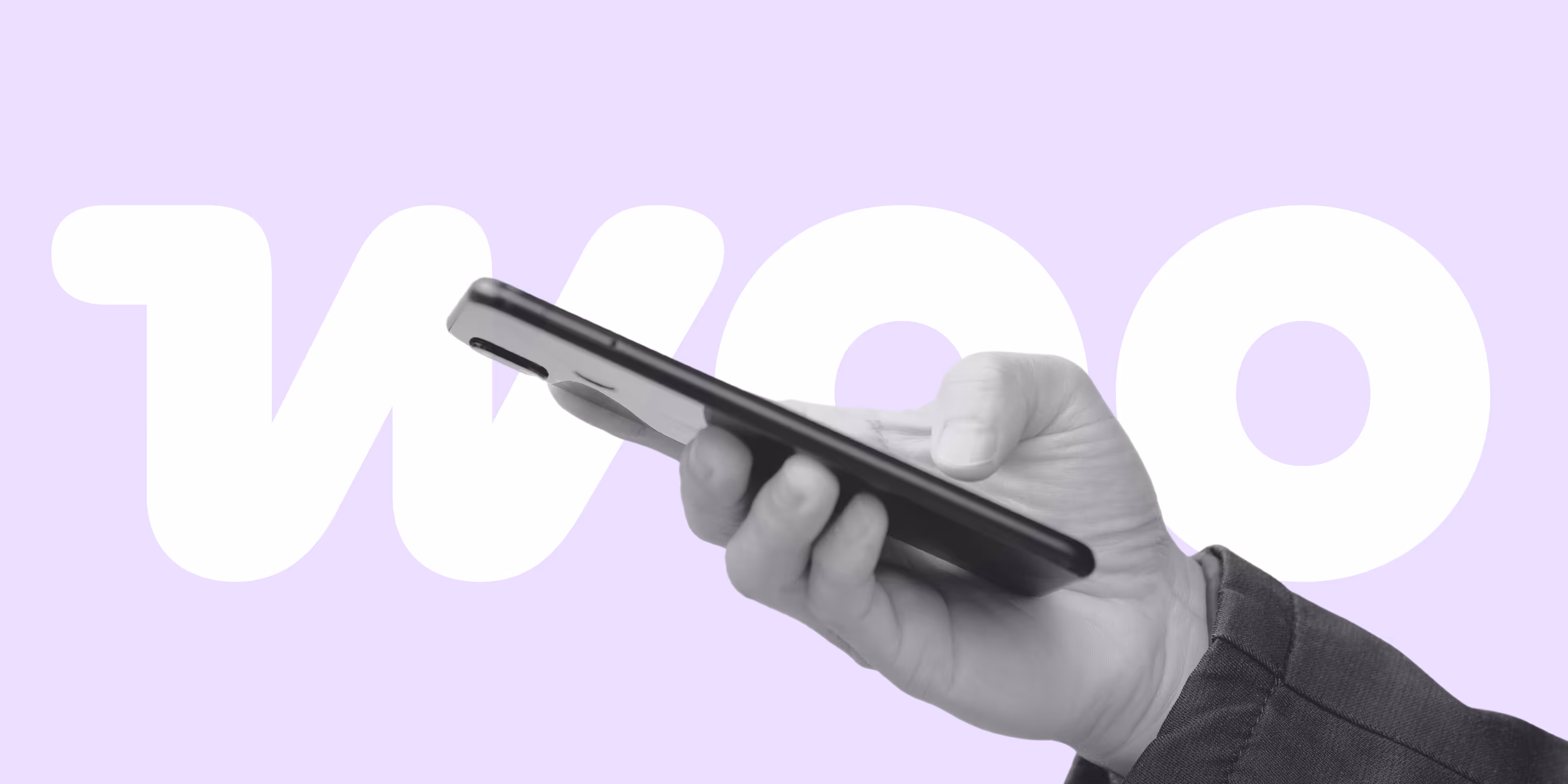
At its core, it’s simple. A “Buy Now” button that moves customers forward instantly. No detours. No unnecessary stops. Just action.
Instead of: add to cart → view cart → proceed to checkout → fill forms → confirm
It becomes: click → done.
Sometimes the product is added, and the customer is redirected straight to the final checkout page. Other times, a quick pop-up collects essential information and processes the order immediately. Clean. Efficient. Almost invisible. This approach removes the psychological gap between desire and ownership. And that gap is where most sales are lost.
Let’s talk about the mind for a second. Buying is emotional first. Logical later. Impulse drives many online purchases. A flash sale. A limited offer. A product that solves a problem instantly. In that emotional peak, speed matters. Delay introduces doubt. Doubt introduces exit.
There’s also decision fatigue. People make thousands of micro-decisions daily. By the time they’re checking out, their mental energy is low. Long forms feel overwhelming. Short actions feel relieving. And then there’s fear. Not fear of the product, fear of complexity. Long checkout pages look complicated. A single button looks easy. And easy feels safe.
Conversions increase when friction decreases. It’s not magic. It’s mechanics. Every extra click is a tiny barrier. Every additional field is a tiny resistance. Alone, they seem harmless. Together, they push customers away.
When checkout is compressed into one decisive action, completion rates rise. Customers don’t overthink. They act. The process feels effortless, almost natural.
Mobile users benefit the most. Typing billing details on a small screen is annoying. Switching keyboards for numbers and zooming in and correcting typos. It slows everything down. Remove that friction, and suddenly mobile conversions climb.
And when the experience feels smooth, customers come back. They remember how easy it was.
Most store owners obsess over traffic. Ads. SEO. Social media campaigns. And yes, traffic matters. But what happens after the click is even more important.
If your store converts 2% of visitors, improving that to 3% can dramatically change revenue. Same traffic. More sales. That’s efficiency.
Simplifying checkout often delivers faster ROI than increasing ad spend. Why? Because you’re optimizing people who already want to buy. They’re halfway there. They need a smoother path.
Fast single-click purchasing turns interest into action more quickly. And quicker usually means more profitable.
On WordPress with solutions like WooCommerce One Click Checkout, streamlined purchasing enhances the experience without sacrificing backend flexibility. Store owners retain control while customers move through checkout faster—especially useful for mobile shoppers or simple product catalogs. It complements the site rather than replacing core functionality.
On Shopify, the equivalent approach often uses Cart Permalinks and optimized checkout flows. These links pre-populate carts or guide users directly toward purchase, reducing friction. For simple product experiences, a direct add-to-cart or checkout permalink can function much like a one-click experience. For stores with variations or complex selections, permalinks still help by preserving customer intent and reducing steps.
The principle is the same across platforms: implementation should match the product and audience. Simple products benefit from minimal clicks. More complex catalogs benefit from clear pathways that guide users without overwhelming them. When executed properly, these tools enhance conversion while maintaining control and flexibility on the backend.
Design influences decisions more than we realize. A cluttered checkout page creates stress. A clean layout creates calm.
Clear calls-to-action work better than clever ones. “Buy Now” is powerful because it’s direct. No guessing. Limit form fields to essentials. Name. Email. Phone. That’s often enough. Asking for unnecessary details feels invasive.
And always provide instant confirmation. Customers want reassurance that their action worked. A confirmation message. An email. Something. Silence makes
people nervous.
Mobile shopping dominates. Yet mobile checkout often lags. Tiny buttons. Hard-to-read text. Too many input fields. It’s frustrating.
Single-click purchasing reduces typing. Reduces scrolling. Reduces loading. It fits the mobile mindset, quick interactions, and minimal effort.
Picture someone shopping while waiting in line for coffee. They have two minutes—maybe less. If checkout takes longer than that, the sale is gone. Fast purchasing respects context. And context is everything in mobile commerce.
Speed should never feel suspicious. That’s important. Customers still want security. They want to know their payment is safe. Their data is protected. So visible trust signals matter, secure payment badges, clear policies, and transparent pricing.
Trust and simplicity are not opposites. They can coexist. A streamlined checkout that also feels secure is powerful. It tells the customer: we value your time, and we value your safety. When trust is present, fast purchasing feels convenient rather than risky.
You can’t improve what you don’t measure—track conversion rates before and after implementing single-click purchasing. Monitor cart abandonment. Watch mobile performance metrics closely.
Often, the changes are noticeable quickly. Faster completion times. Higher checkout success rates. Fewer abandoned carts.
Data tells the story clearly. Sometimes better than we expect. And once you see improvement, optimization becomes addictive. Small tweaks. Slight adjustments. Continuous refinement. Growth compounds over time.
Competition online is brutal. Customers compare instantly. If your checkout feels long and your competitor’s feels easy, guess who wins?
Convenience is a competitive weapon. Not flashy. Not loud. But effective. Shoppers remember smooth experiences. They may forget prices, but they remember frustration. And they remember ease.
In crowded markets, subtle advantages make big differences. A shorter checkout might be the edge you didn’t realize you needed.
Flash sales benefit massively. Limited-time offers, too. Urgency paired with speed creates powerful results.
Social media campaigns also convert better with simplified checkout. When someone clicks from Instagram or TikTok, they’re not in a research mindset. They’re reacting. That reaction needs immediate fulfillment.
Single-product stores especially thrive with this model. Fewer decisions. Faster outcomes. Clean funnel. Not every scenario demands it. But many do.
Some products require choices of sizes, colors, and bundles. In those cases, flexibility is key. Offering both traditional checkout and single-click options can satisfy different buyer types.
Some customers like reviewing their cart. Others want it done. Give them both paths. Let them decide how they want to buy. Balance doesn’t mean complexity. It means choice.
The impact goes beyond immediate revenue spikes. Customer satisfaction improves. Repeat purchases increase. Marketing campaigns perform better because the funnel converts efficiently.
When checkout feels effortless, your brand feels modern. Professional. Attentive. Customers return to places that make life easier. It’s that simple. And over time, small conversion gains compound into serious growth.
At the end of the day, conversions are not just about traffic or pricing. They are about momentum. About removing friction at the exact moment, a customer decides to act.
Fast single-click purchasing captures that moment before doubt interferes. It shortens the distance between desire and ownership. It respects attention spans. It values time.
Reducing drop-off isn’t complicated. Often, it requires making things less complicated. Fewer steps. Fewer fields. Faster results.
When you simplify checkout, you remove hesitation. When you remove hesitation, you increase action. And when action increases, so does revenue. In a world where patience is scarce and competition is fierce, speed wins—every time.
FireNet Designs is a verified Shopify Partner, featured in the official Partner Directory. Since 2022, we’ve delivered lightning-fast Shopify design, development, SEO, app builds, and more—4x faster, at half the cost. No fluff, no middlemen—just results. The Anti-Agency for brands that want growth, not delays.

Get expert eyes on your storefront
© FireNet Designs Inc.


