What it didn't have was a way to help people pick one.
More than 20 clinicians worked there, across a range of specialties, treatment styles, and schedules, and a first-time visitor was basically on their own to figure out who to book with. That's a lot to sort through, and most people didn't feel guided by it. They felt lost.
Part of the reason was that the website had grown into a reference library instead of a booking tool. The things that actually drove bookings, like the free consultation, were buried under long pages and old content. The contact form had been failing for a while without anyone noticing.
So people either gave up on the site or called the clinic to ask the one thing the website never answered for them: which therapist is right for me?
At the same time, the clinic was spending on Google Ads and social media to bring new people in. That part worked. Visitors arrived. The website just didn't do much with them once they got there. The problem was never traffic. It was turning the traffic they already paid for into people who actually booked.
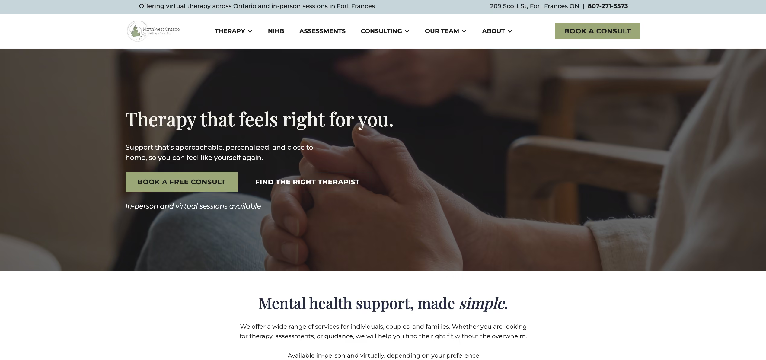
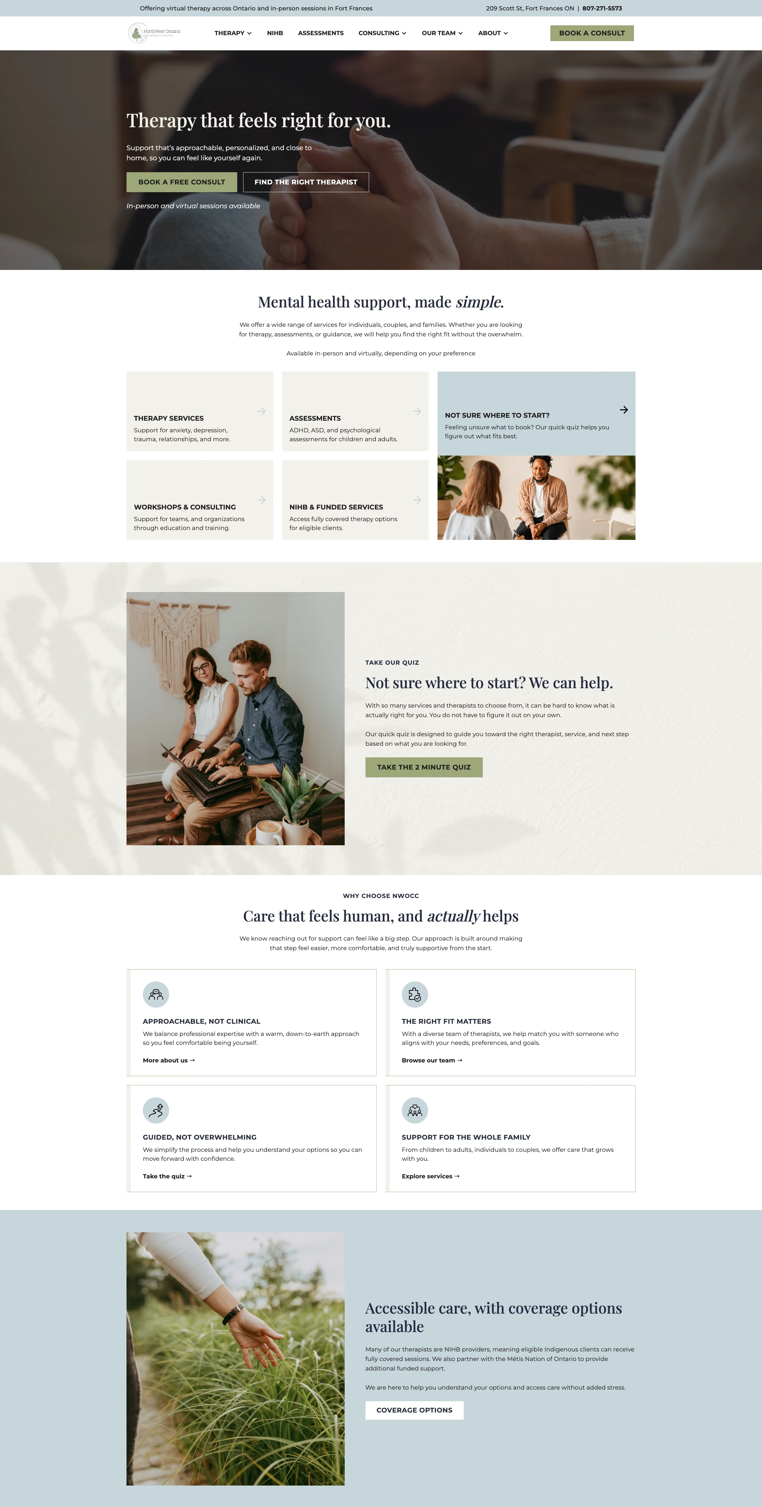
So we didn't redesign the site around how it looked. We redesigned it around how people decide. We mapped the whole path, from "I need help" to "I've booked my appointment," and pulled out the friction wherever we found it.
Across desktop and mobile, we produced 102 approved design frames, working closely with the client before handing the designs off to FireNet's development team and Carley Dupuis for implementation.

Here's what the project covered:
- Moved the site off WordPress and onto Webflow, which made it faster, more reliable, and easier to keep updated.
- Built a six-question matching quiz that recommends the best-fit clinicians and then hands visitors off to Jane for online booking.
- Rebuilt the therapist directory with filtering by specialty, modality, gender, availability, age group, and therapy type.
- Rewrote the copy so the services are easier to understand and the site asks less of the reader.
- Put the free consultation offer somewhere people can actually see it, across the main landing pages.
- Built accessibility into every page: proper heading structure, better color contrast, semantic HTML, and descriptive alt text.
- Set up a geo-targeted SEO structure for Northwestern Ontario, with clear internal links between services, workshops, and therapist profiles.
Every one of those choices came back to the same goal: help someone decide, and help them decide sooner.
It changed how people move through the site. Instead of comparing 20-plus therapists on their own, visitors answer a few short questions, get pointed to the clinicians who fit their situation, and go straight to booking. And the things that used to trip people up on the way there, the outdated content, the broken form, the confusing navigation, the calls to action nobody could find, are gone.
In the end, NorthWest Ontario Counselling & Consulting was happy with the result, with early improvements showing in key website metrics and a clearer path from finding the right therapist to booking a consultation.
If your website is making customers work too hard to take the next step, FireNet Designs can help. Let’s build a website that makes choosing easier and converting more natural.


Real solutions. No guesswork. Just results.

FireNet Designs is a verified Shopify Partner, featured in the official Partner Directory. Since 2022, we’ve delivered lightning-fast Shopify design, development, SEO, app builds, and more: 4x faster, at half the cost. No fluff, no middlemen, just results. The Anti-Agency for brands that want growth, not delays.
Get expert eyes on your storefront
© FireNet Designs Inc.