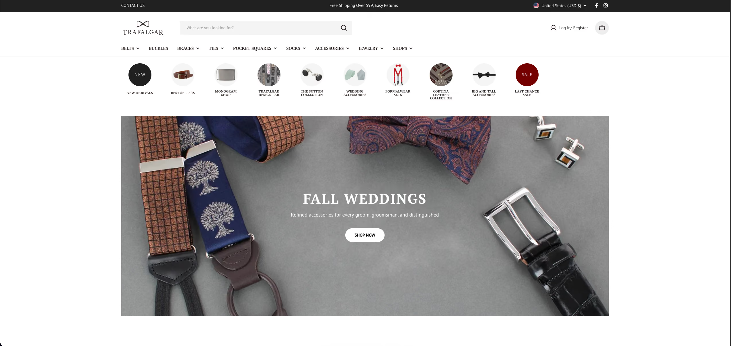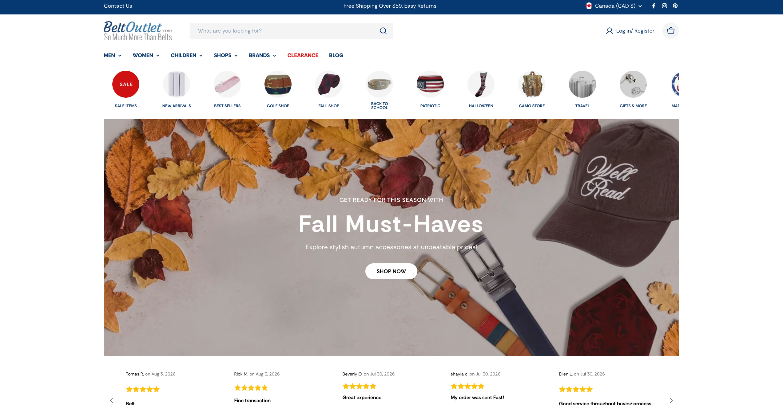
The affordability brand in their two-brand leather-goods business had close to 2,800 products and steady paid traffic coming in through Google Ads. What it didn't have was a store built to turn that traffic into orders. By the client's own read it was converting under 1%, against a target of 1.5 to 3%. Our job was the store itself: custom theme development, and the specific work a catalog that size needs to actually sell.
We moved Belt Outlet onto a current Shopify theme and cleared out the legacy scripts and old apps the previous build had wired straight into it. The store isn't dragging years of debt into every page anymore. It's lighter, and it's built on something that can keep up.
We then tested the store's speed and quality with Google's own tool (Lighthouse), before the work and after, on phone and desktop. The scores that are steady enough to trust all went up.
The phone now spends far less time frozen while it works through code in the background: about 60% less on the collection page and 40% less on the product page. That's most of why it feels quicker to use, not just why it looks quicker.
The basics under the hood improved. We fixed the page's heading structure and made low-contrast text easier to read, and two scores moved because of it. Accessibility went from 79 to 96 on the homepage.
And the built-in SEO score, which reflects how cleanly Google can read each page, went from 85 to 92 on the homepage and product pages.
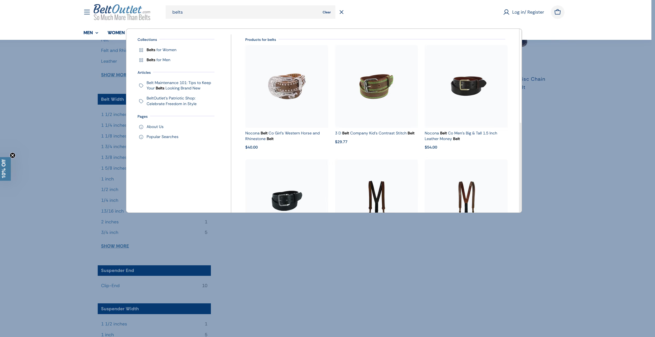
Search, collections, and filters run on Algolia, and the setup had fallen behind its own updates.
On a 2,800-product store that matters more than almost anything else, because search is how most people actually shop it. We rebuilt it on the current version so a shopper finds the belt they came for in seconds instead of scrolls.
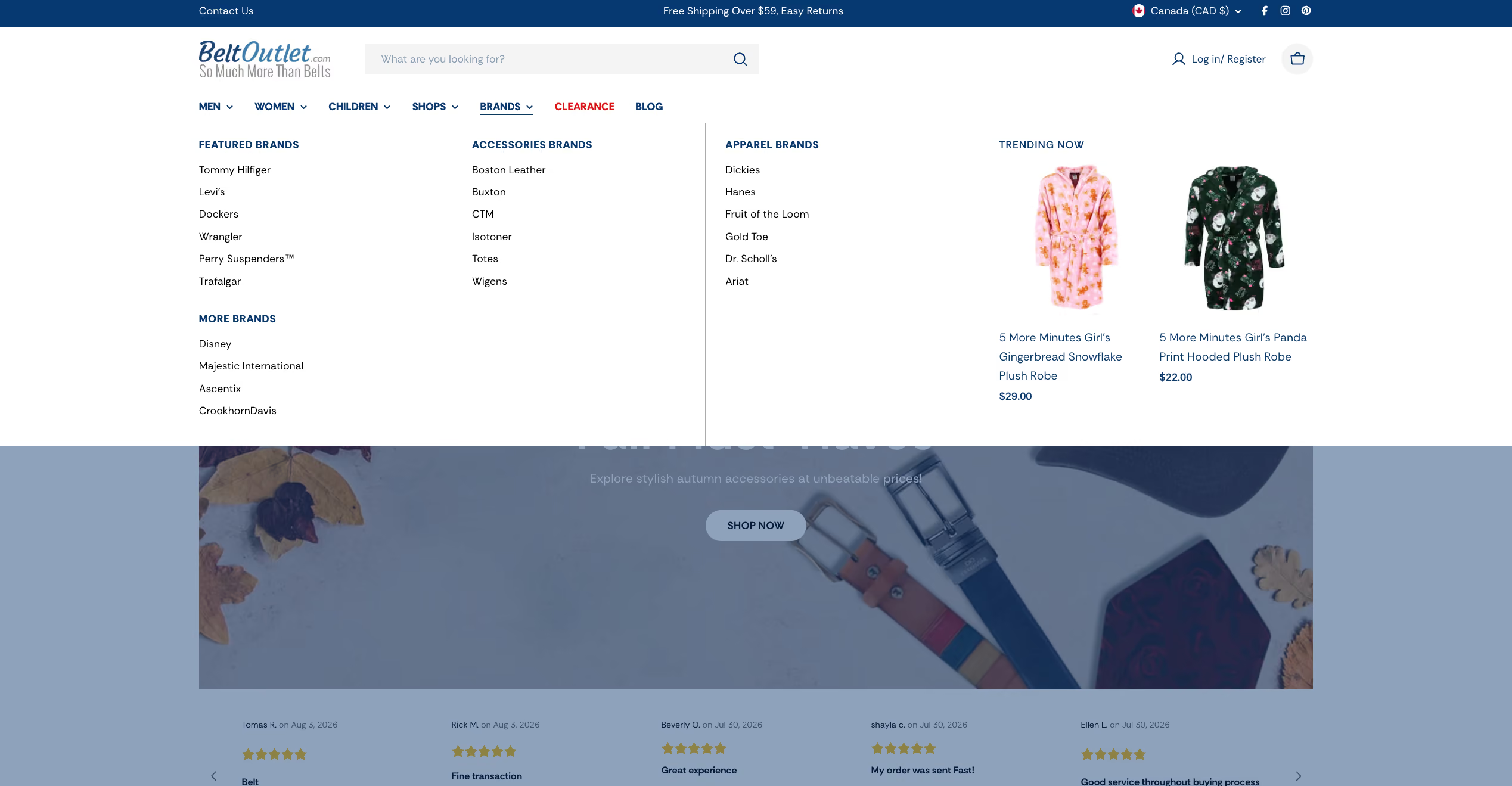
The Men's and Women's mega menus were large and busy, and heavy going on a phone. We tightened them into something a shopper can move through quickly, and made them work on mobile, where a big catalog usually falls apart.
The product pages dropped every detail into one block of text, so the thing a buyer was scanning for was buried in a paragraph. We restructured them so the features a buyer checks first are up top and easy to read, with the full details a scroll away and a clearer path to add to cart.
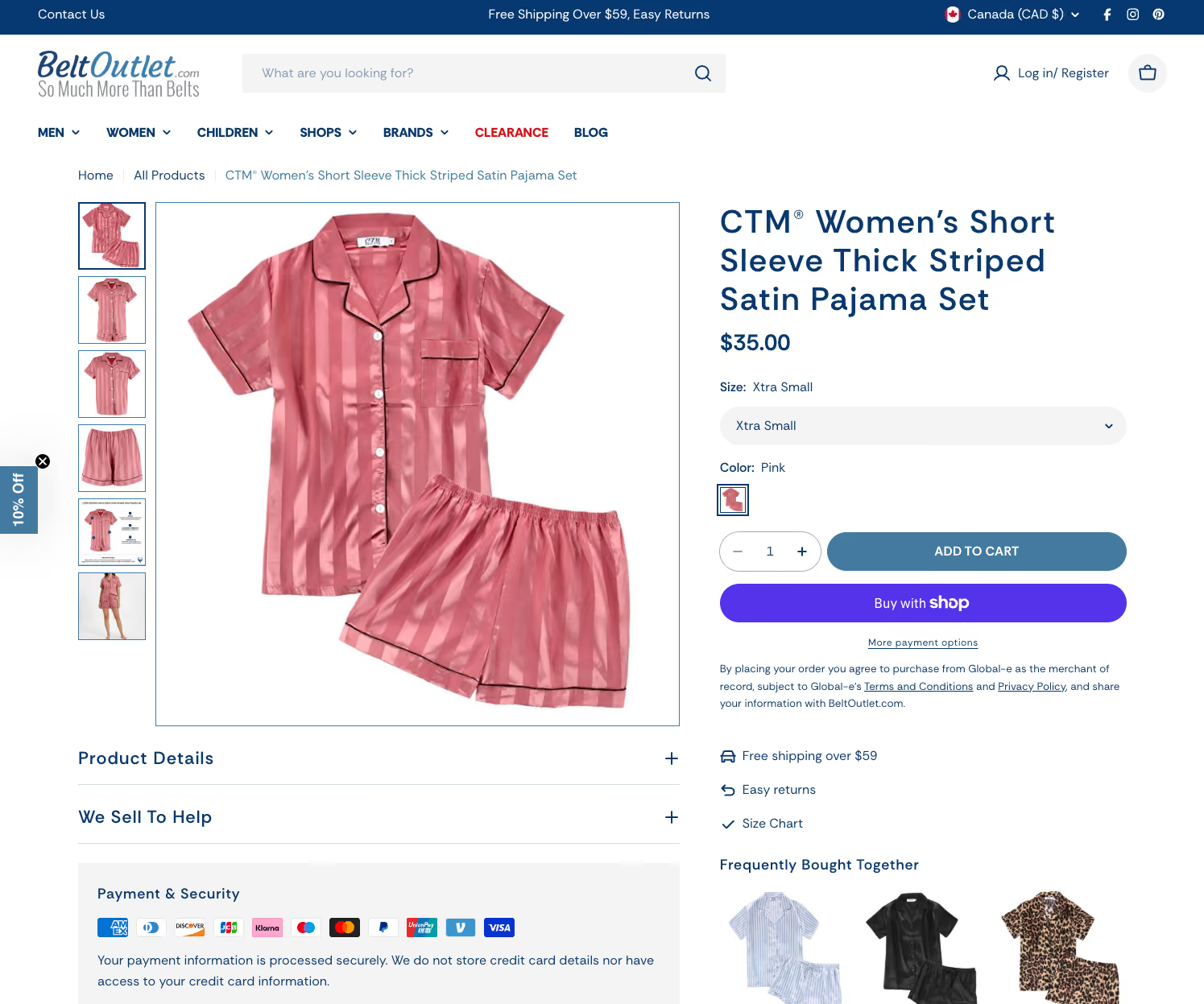
We fixed the parts a shopper never sees but a sale depends on: a clean heading structure so search engines read each product the right way, and readable contrast so the words on a page are actually legible.Every piece came back to one goal: give the traffic they were already buying somewhere worth landing. The result is a store that matches the money going into it. Fast to search, easy to move through, and built to turn a first-time visitor into a buyer.If you're paying for traffic into a store that still makes people work to buy, the traffic isn't the problem. The landing is. Reach out and we'll take a look at yours.


Real solutions. No guesswork. Just results.

FireNet Designs is a verified Shopify Partner, featured in the official Partner Directory. Since 2022, we’ve delivered lightning-fast Shopify design, development, SEO, app builds, and more: 4x faster, at half the cost. No fluff, no middlemen, just results. The Anti-Agency for brands that want growth, not delays.
Get expert eyes on your storefront
© FireNet Designs Inc.