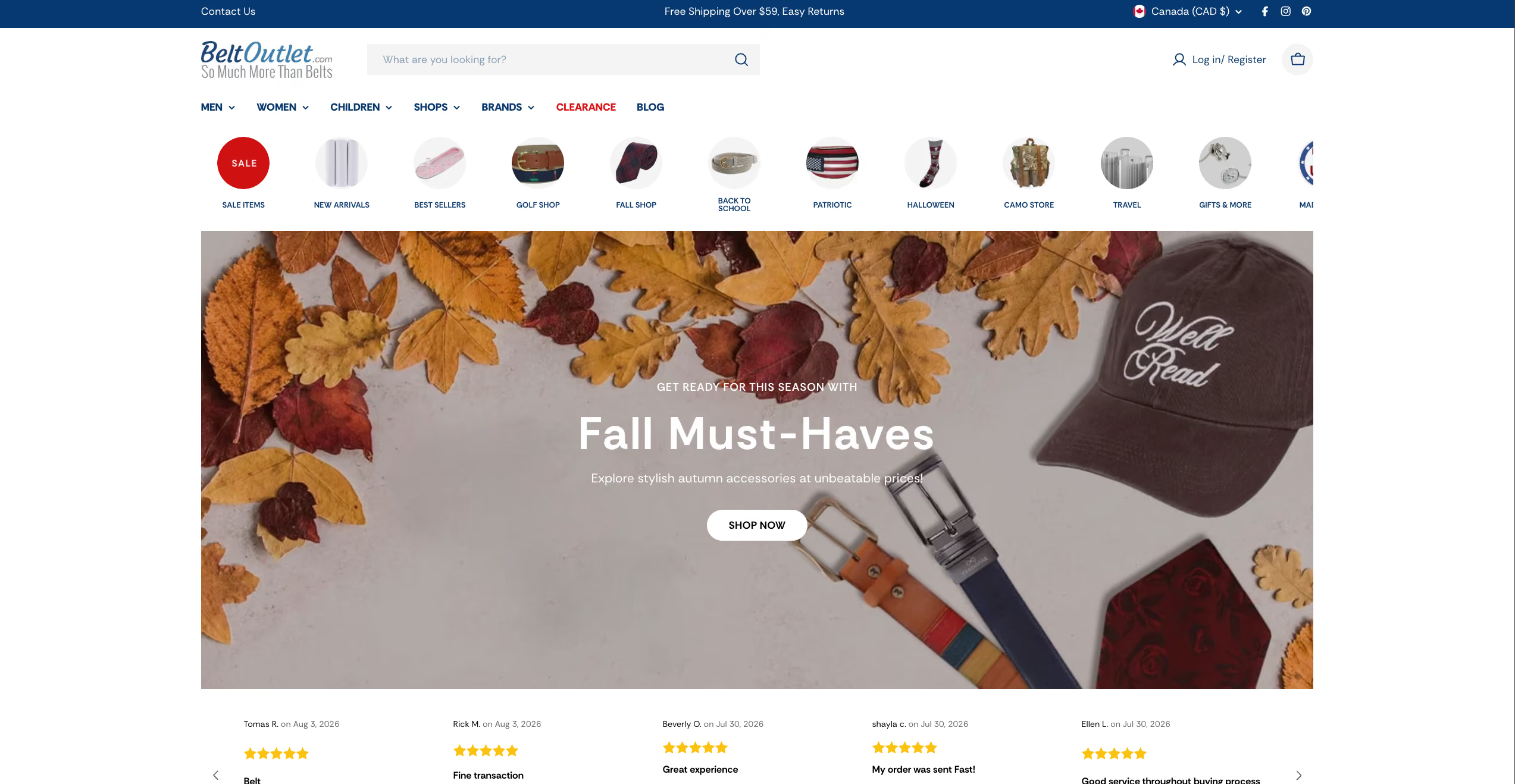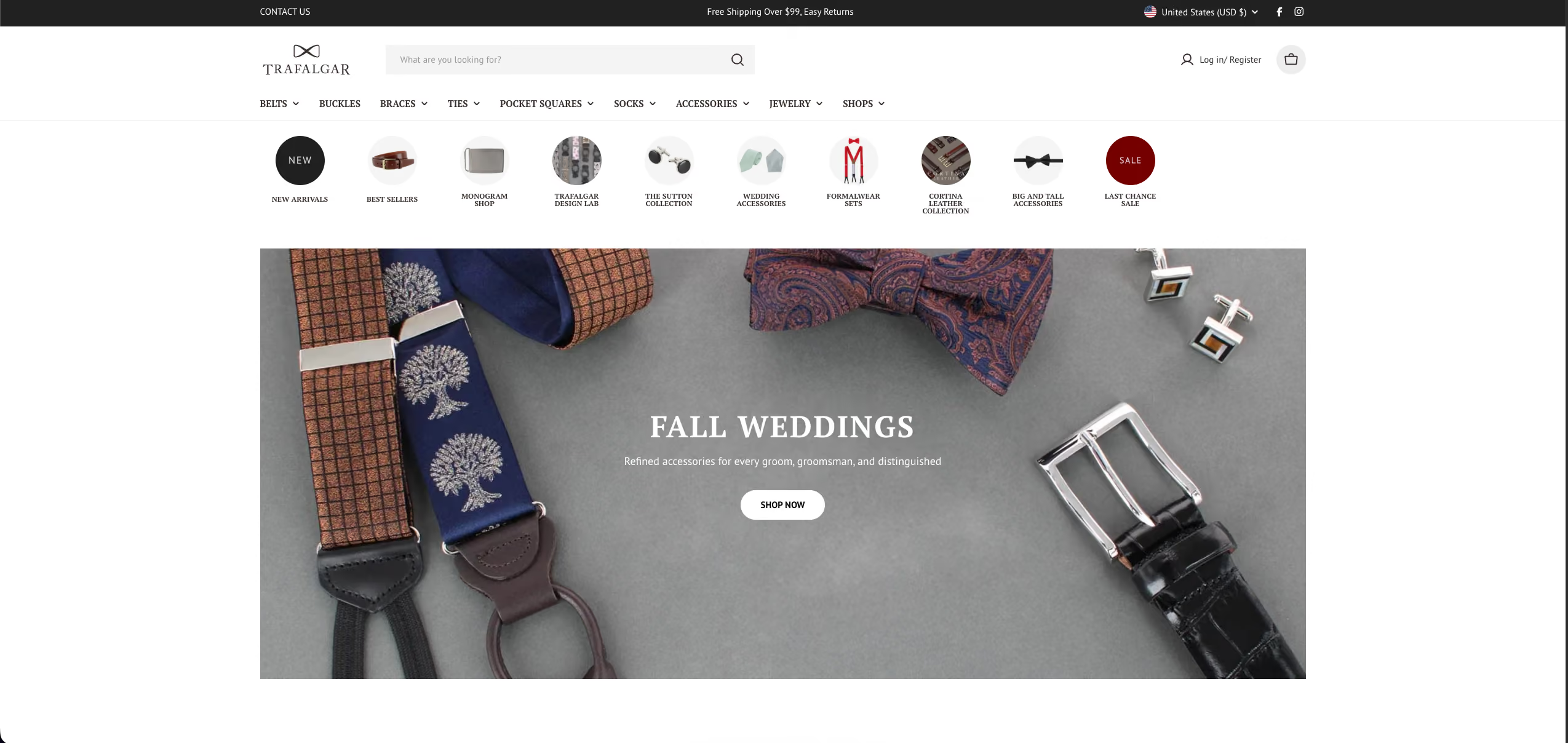
Trafalgar sells premium leather goods and gives 15% of every sale to charity. You couldn't tell either of those things from the old website.

What it had was a store that listed products. What the client wanted was a store that felt like the brand: clean, classic, and led by the photography, the way Brooks Brothers and Leatherology feel the moment you land on them. Instead, the collection pages were bare grids with no context, and the product pages were a wall of text you had to wade through to find the one detail you actually cared about. Search had fallen behind its own updates, so moving through a 640-product catalog was slower than it should have been.

Traffic wasn't the issue. Trafalgar was already bringing people in through Google Ads and a growing influencer network. They showed up. The site just didn't do much with them once they did. We were never hired to find more visitors. We were hired to turn the ones they were already paying for into buyers.

What we built

We rebuilt Trafalgar around two goals: make the site feel like the brand, and make it easy to buy.

  • A store that looks like the brand. We rebuilt it on a modern Shopify foundation and designed it in Figma to match the brands the client pointed to, Brooks Brothers and Leatherology. Clean, classic, and led by the product photography.
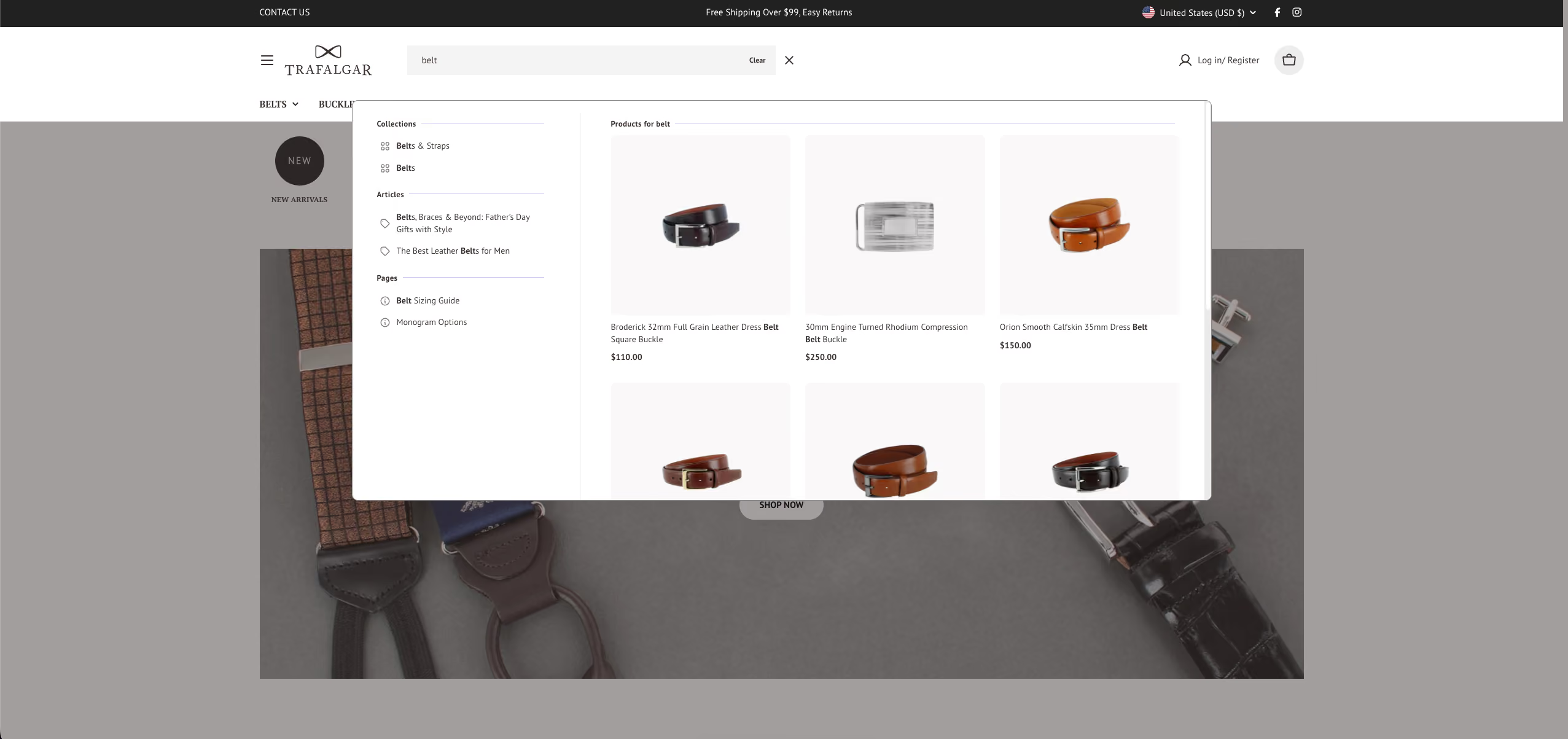
  • Search that keeps up with the catalog. The Algolia setup behind search, collections, and filters had drifted several versions out of date. We rebuilt it on the current version, so a shopper finds what they came for in seconds instead of scrolling.
  • Collection pages with context. A short intro at the top of each collection and real internal linking through the catalog, so a collection reads like part of a store instead of a grid of tiles.
  • Product pages built to sell. The features a buyer scans for sit up top and are easy to read, the full details are a scroll away, and the path to add-to-cart is clearer.
  • Navigation a shopper can move through. Tighter menus, so getting around the catalog isn't a fight.
  • The groundwork the ads depend on. Schema markup so products can show as rich results, a clean heading structure, and an accessibility baseline, so the store reads right to search engines and to everyone else.

The result is a store that looks like what Trafalgar actually is, and stays out of the way between the moment someone lands and the moment they check out.
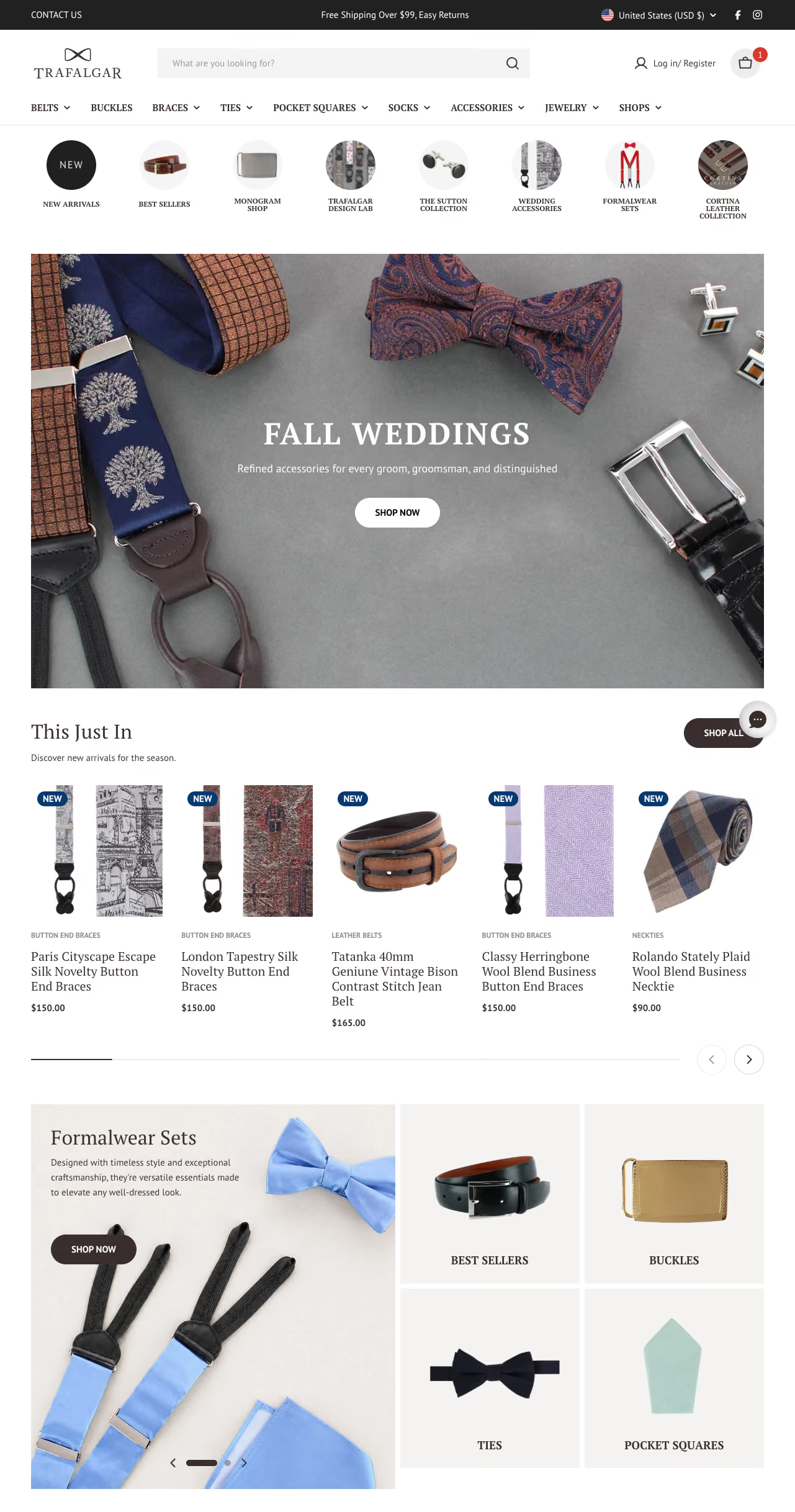
A screencapture of trafalgar's homepage

Results: Lighthouse and SEO wins

Performance

  • Homepage jumped from 36 to 61 on mobile and 77 to 90 on desktop.
  • Collection pages went from 38 to 50 on mobile and 40 to 63 on desktop.
  • Product pages climbed from 35 to 48 on mobile.

Largest Contentful Paint (load speed)

  • Homepage mobile LCP dropped from 33.2s to 3.8s.
  • Homepage desktop LCP dropped from 2.6s to 1.2s.

Layout stability (CLS, lower is better)

  • Collection page CLS fell from 0.896 to 0.062 on mobile, and from 1.332 to 0.091 on desktop.
  • Product page CLS fell from 0.170 to 0.004 on mobile.

Accessibility and SEO

  • Collection page accessibility reached a perfect 100 on mobile.
  • SEO held at a strong 92 across the homepage and collection templates, on the schema, heading, and accessibility groundwork built into the rebuild.
A screencapture of the product search

Work with us

If you're paying for ads and influencers to send people to a store that doesn't look like your brand or make it easy to buy, the traffic isn't your problem. The landing is. We rebuild the site around the brand and the buyer, so the visitors you're already paying for have somewhere worth landing. See if your site is leaking sales.

Multiple Women in a Photo who received Tans By Kait WinnipegThe landing page of beltoutlet
Photo of Article everything need to start an online store and sell online

Ready To Take Your Shopify
Store To The Next Level?

Make My Shopify Store Work

Real solutions. No guesswork. Just results.