LD Keyfinder sells luxury keychains on Shopify. Round one won on desktop while most shoppers were on their phones, so we read the sessions and rebuilt the first screen. Then we made the whole store faster and tested that too.
LD Keyfinder sells luxury keychains on Shopify: gold- and platinum-plated details, gemstone and crystal beads, limited-edition drops. Most shoppers meet the brand for the first time on their phone. They land on a product page, and that first screen decides whether they keep going.
The product page was not winning that moment.
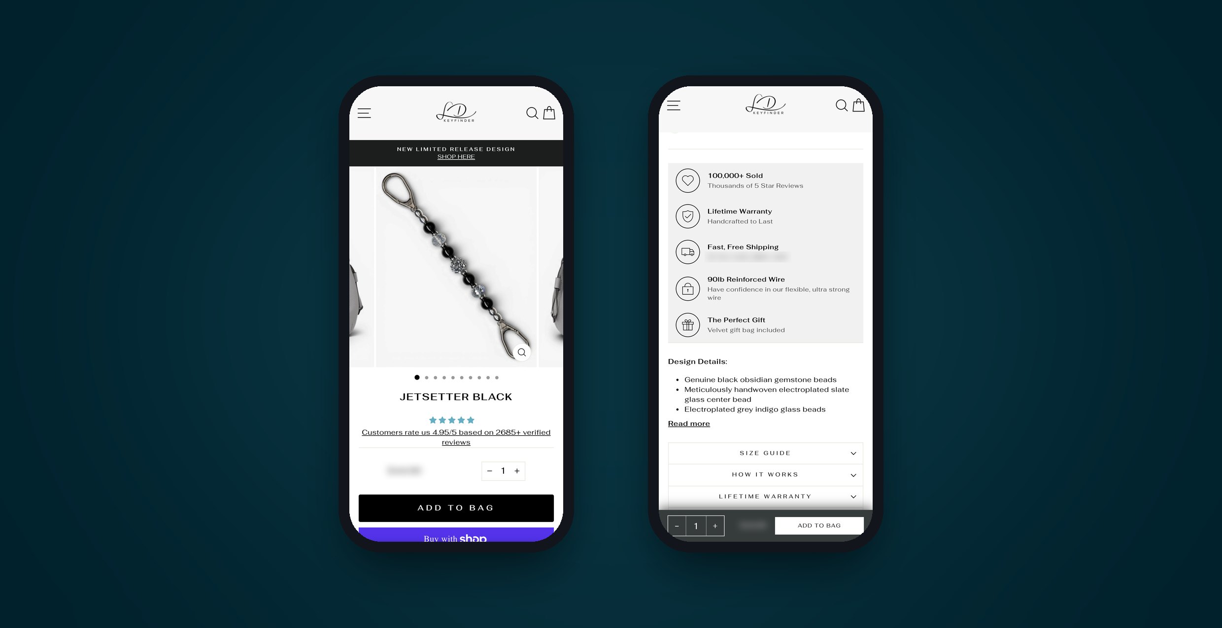
We rebuilt the page around how a first-time mobile shopper actually reads it:
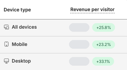
We tested it head-to-head against the original for three and a half weeks. A week in, the new page trended ahead, but soft. Microsoft Clarity session data pointed at the order of the page, so we resequenced it mid-test: warranty and ships-from-Canada up top, the best-performing GIF higher, weak sections lower. On June 3 it closed as a win: revenue per visitor up 5.3%, conversion up 3.6%. Same traffic, more revenue out the other end.
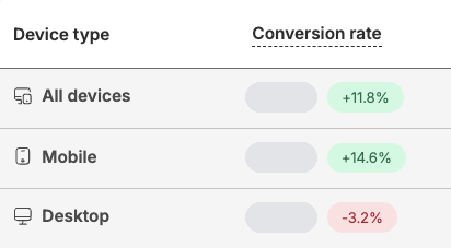
But look where the conversion lift landed:
We had improved the page for the shoppers who already converted best.
Plenty of agencies would bank that win. We went back into Clarity and watched the mobile sessions instead.
The story was right there. Scroll depth was shallow. Most mobile visitors never made it down the page, and nearly all the interaction clustered on the product images at the very top. Shoppers judged the product on the first screen and left before they reached the proof below it.
So we stopped trying to pull people down the page and moved the proof up to where the attention already was.
Three changes, all aimed at the first screen:
Sometimes the conversion-correct choice and the brand-guideline choice aren't the same. You make that call with data.
Here is the same product page, zoomed in on the parts rounds one and two changed. Round one's sticky bar is rebuilt from its original theme code, and the April frames come from a web archive copy shown with today's theme styles. Prices are blurred.
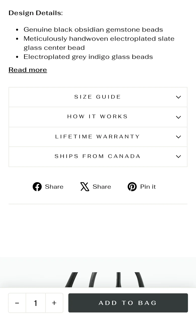
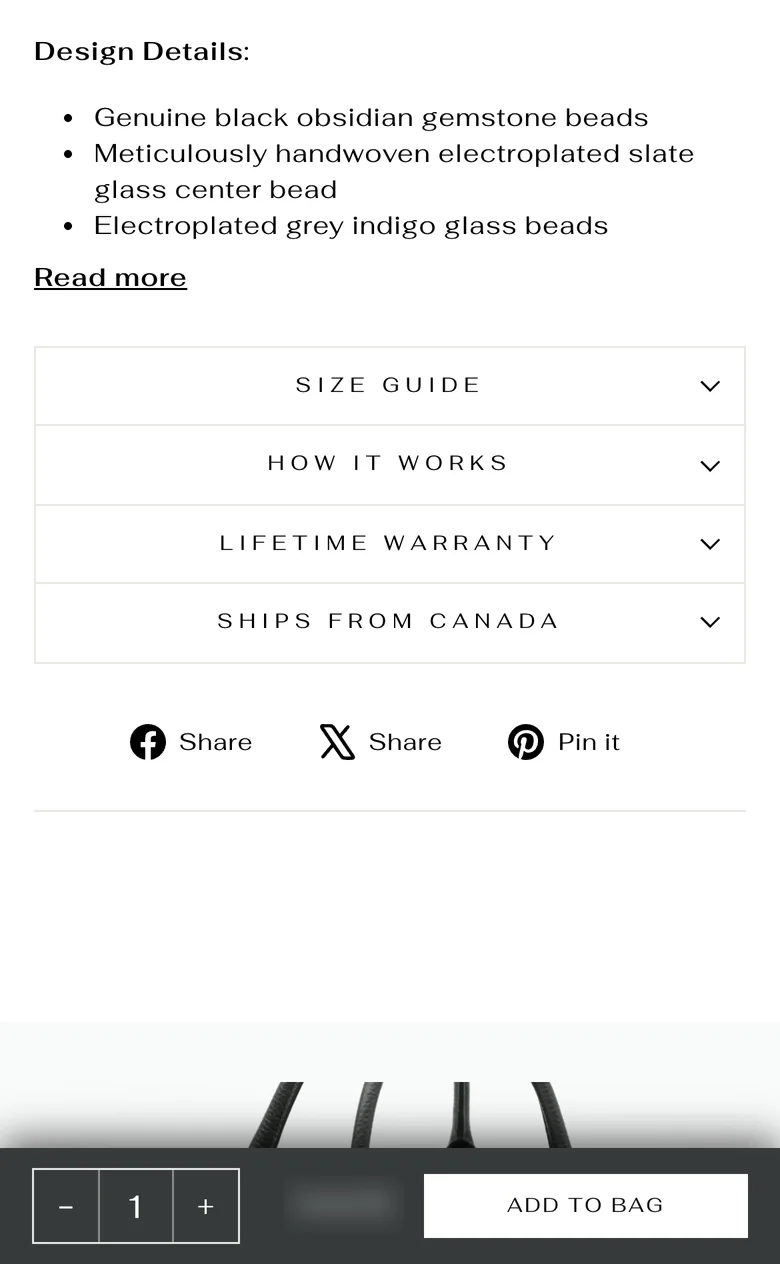
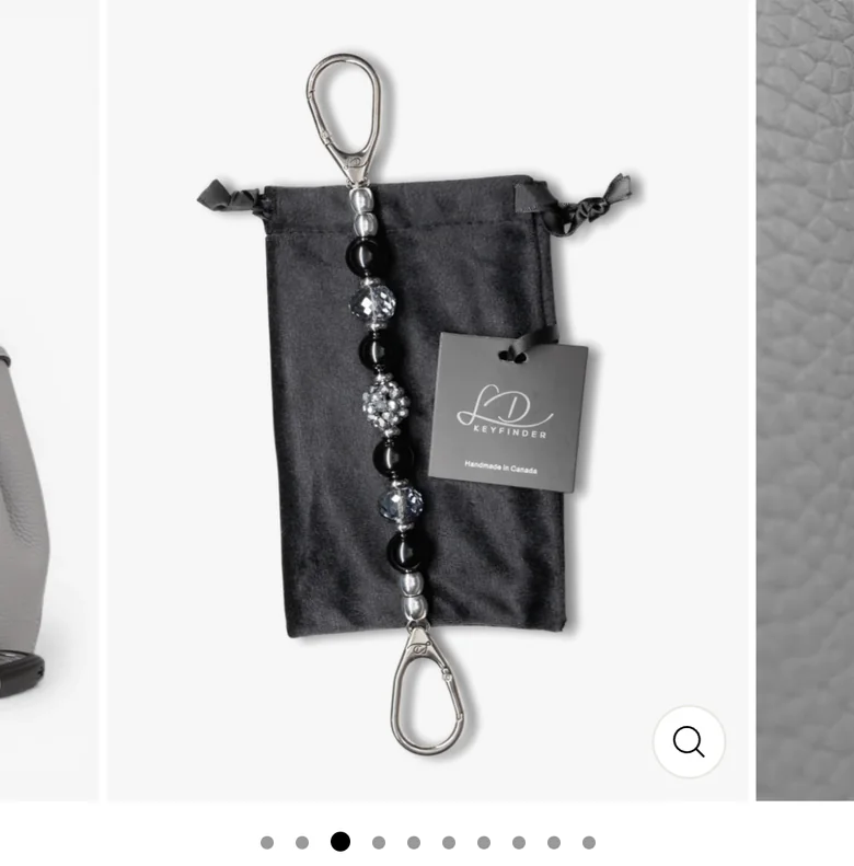
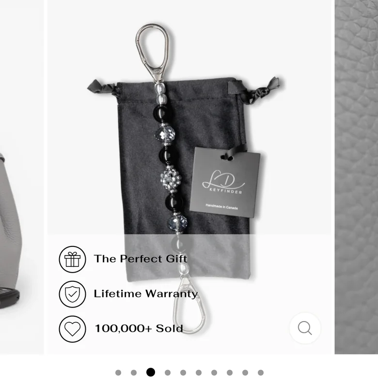
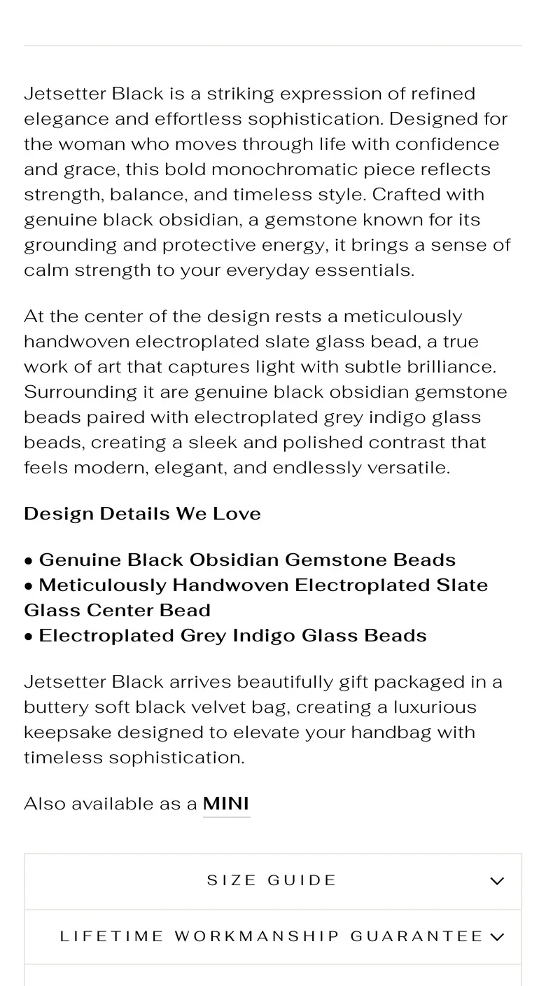

Round two ran head-to-head against the round-one page from June 10 to 15 and came out ahead almost everywhere.
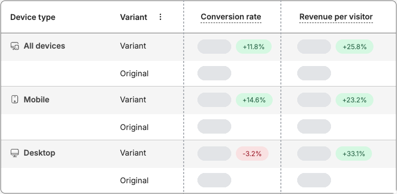
In the 30 days ending late June 2026, the month round two ran, the whole store did more with slightly less:
Fewer visits, more sales. That's the point of CRO: converting more of the traffic you already have. Store-wide numbers include everything else that happened that month, so read them as context, not proof.
Most speed work gets sold on a score. We A/B tested ours against revenue.
Ahead of Black Friday, we ran the loop across the whole store: about two dozen fixes, most of them to how pages load, without uninstalling a single app. Among them:
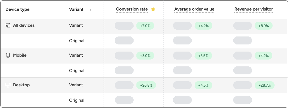
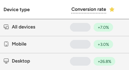
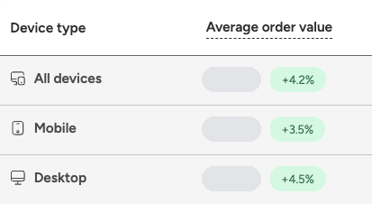
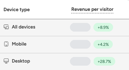
A lab number is still a score, so we split live traffic between the faster store and the store as it stood, September 22 to 28. The faster store came out ahead on every metric, on every device, and we shipped it. Across all devices:
The honest read: desktop moved the most, mobile the least. Under a week is a short test, and speed wasn't the only change, so we treat these lifts as direction, not a final number.
The product page was the opening move, and we ran the loop on it twice. Then we took it sitewide. CRO compounds. Each win funds the next test.
The numbers on this page come from LD Keyfinder's own tests. Outside research explains the thinking behind moves like these. Each source is scoped to what it actually shows, and none of them tested this store.


Real solutions. No guesswork. Just results.

FireNet Designs is a verified Shopify Partner, featured in the official Partner Directory. Since 2022, we’ve delivered lightning-fast Shopify design, development, SEO, app builds, and more: 4x faster, at half the cost. No fluff, no middlemen, just results. The Anti-Agency for brands that want growth, not delays.
Get expert eyes on your storefront
© FireNet Designs Inc.